BATHROOM PAINTS – COLOUR CONSULTANCY FROM ENGLAND.
Joa Studholme is the colour consultant at Farrow & Ball, the British luxury paint company. Talking to her about paint colors is like diving into a new dimension.
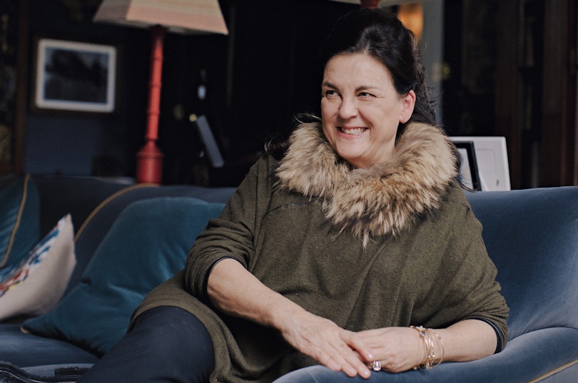
JOA STUDHOLME has been obsessed with colour ever since she was a little girl. She would dream about colour. She would think about colour. She would even associate events or periods of time with colour. “If we went away for a family break and I saw a pink sky, I’d refer to it as ‘the pink holiday’,” she says.
For the last 22 years, she’s been working as International Colour Consultant for Farrow & Ball, the luxury paint and wallpaper company in Wimborne, Dorset. Their instantly recognisable and traditional heritage paint colours have been a staple of discerning houses for over two decades. Decorating your house in Farrow & Ball is now something of “a badge of honour” says Joa Studholme.
We meet at Deans Court, a private residence in Wimborne, which is predominantly painted in Farrow & Ball. “We are seeing the use of very bold colour returning to our homes” says the colour expert. “First, people would bring colour into their hall to give a sense of drama whenever they opened the front door. That gave them license to continue with the strong colour theme in other rooms.” Her tip: put a splash of stronger colour in the back of a kitchen dresser or on the skirting around the bath or shower.


The colours that make up Purbeck Stone, an understated mid-grey. The perfect colour for a bold statement: a staircase in Deans Court.
The mood of every room
can be enhanced with the right shade.
One part of her job is to visit clients at home to consult on their design projects. “I discover the colours they will be comfortable with, see what works with their architecture and – importantly – look at the light in a particular space,” she says.
Another part of her job is creating the colours on the Farrow & Ball colour range. This is done every three years on average, and, for every new colour she creates, an existing one is taken off the range of 132 shades.
Joa Studholme has been “unbelievably lucky to work for Farrow and Ball.” And as perk of the role, everywhere she looks she notices colours that she has created. “I’ll go to an exhibition at the National Gallery in London and see a colour on the wall and ceiling that started off in a ramekin on my kitchen table,” she says. “Even after all these years, that’s a very exciting feeling."

The drawing room, at Deans Court which was painted in the 1920s. The most similar hue in the Farrow & Ball range is Arsenic.
ADDING COLOUR
TO BATHROOMS.
Elevate your bathroom to stylish perfection by using a colour scheme with shades that harmonise; draw attention to a bathroom wall with a bold paint colour. Great bathroom design and perfectly chosen bathroom colours can be truly transformative. From calming to on-trend: embrace colour in the individual design for your perfect bathroom. With the COORDINATED COLOURS COLLECTION by KALDEWEI.


